sellxout
SellXOut is a disruptive lifestyle and apparel brand built for the fearless — the creators, hustlers, and outliers who refuse to blend in. Rooted in individuality and rebellion, SellXOut embodies the mindset of turning vision into movement — where creativity meets commerce, and self-expression becomes a statement. The name was intentionally chosen to challenge convention and reclaim what it means to “sell out” — not as a compromise, but as a declaration of owning your craft, your grind, and your success.
DELIVERABLES
Logo
Website
Branding


sellxout
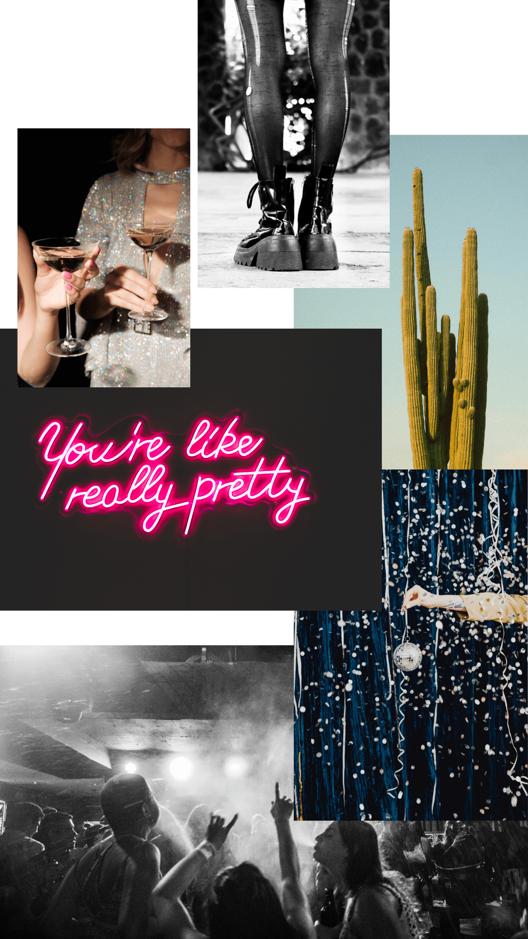
The mood board for SellXOut captures the raw, unapologetic energy of modern rebellion — where creativity, chaos, and confidence collide. The visual tone blends gritty urban textures with clean, high-contrast design, symbolizing the tension between art and commerce. The color palette is bold and deliberate: matte black, chrome silver, and electric white, punctuated with flashes of acid orange or deep red to reflect power, irony, and disruption.
Branding Rationale:
The concept behind SellXOut reclaims the term “sell out” and turns it into a movement — a middle finger to the idea that success compromises authenticity. The brand challenges the creative double standard that says you can’t make money and stay true to your art. By fusing irony with empowerment, SellXOut speaks to a generation of entrepreneurs, designers, and disruptors who are done apologizing for winning.
The name and aesthetic together create a brand that’s equal parts rebellion and refinement — raw enough to feel real, sharp enough to demand attention. SellXOut doesn’t blend in; it brands loud, lives louder, and celebrates the unapologetic pursuit of both creative expression and financial success. It’s not just a label — it’s a lifestyle, a statement, and a reminder: you didn’t sell out — you finally cashed in.
BRANDING GUIDE
Logo Variations
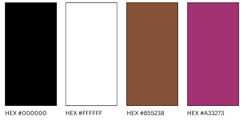
Color Palette
Mood Board
Fonts
Heading | UnifraftorCoof
SubHeading | Josefin Sans
